
An infographic on the varying significance of colors per country, letting e-commerce sellers know which hues to use. Design by Danielle Gray.
For 15 months, I was invited to create a marketing content program for a nascent payment processor, which had just received an influx of venture capital. The assignment required a more analytical and targeted approach; this was B2B (business to business) content generation instead of B2C (business to consumer). I had to research and spend time with an explicit audience, discover its pain points, and create resources that addressed those anxieties. This initial research included forming consumer typologies and mapping content formats to a sales funnel. 2Checkout’s product offering was enticing for its era—software interacting with banks, currency converters, and payment-type converters to empower as many people in the world to sell things online without boundaries. Other processors lacked the authorization and technology to have international sellers reach a global audience.
I customized campaigns to international e-commerce sellers of specific products in specific countries (software vendors in China, clothiers in the Middle East, etc.), working off a gated content model. While the blog and podcast content were free, visitors could only download e-books by submitting contact information. That lead information would enter a sales funnel, pass through an automated email system and, if the lead was vetted, eventually reach a customer service representative and potential sale. I raised sign-ups by 61% and generated $6.3 million in gross transactional volume through the program. Aside from content generation and strategy, I also managed internal communications, PR, and side projects: branding guidelines, the aforementioned consumer typologies, and a mock trial version of the software for curious parties, among other projects.
E-BOOK SAMPLES

25 Tips to Master International SEO
E-books stood at the core of 2Checkout’s content marketing strategy. All blogs and podcast posts would conclude with a button advertising an e-book, and as stated above, the reader would have to submit contact information—ranging from industry identification to a contact email or phone number—to access the gated PDF. Some of that data would be used to identify which audiences were visiting 2Checkout’s website, potentially prompting a reevaluation of the messaging and product features. The contact information would be used in the sales funnel, and if a lead proved appropriate, they would be contacted by the sales team.

25 Tips to Master International SEO
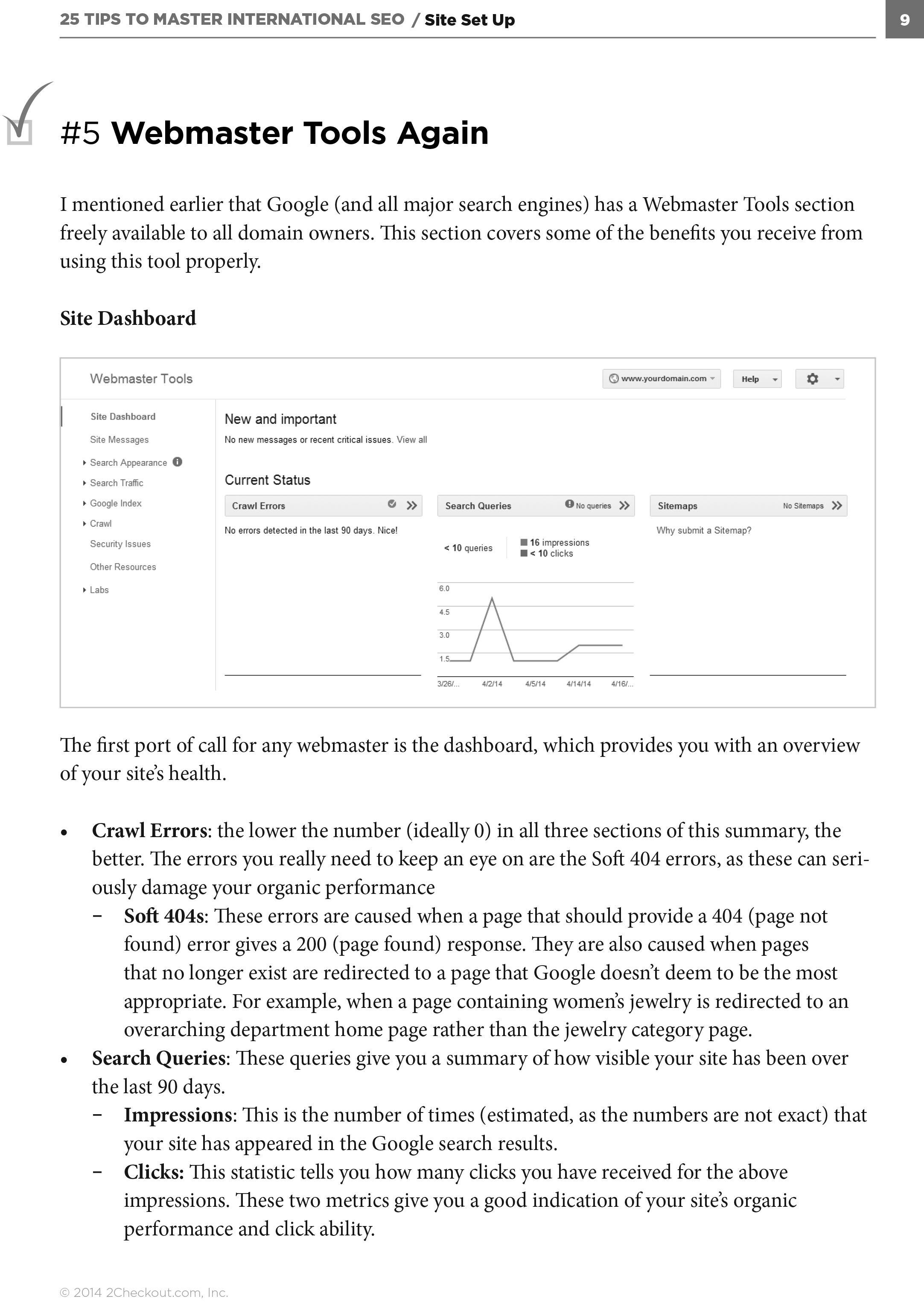
25 Tips to Master International SEO

6 Strategies to Localize Your Site for a Global Audience
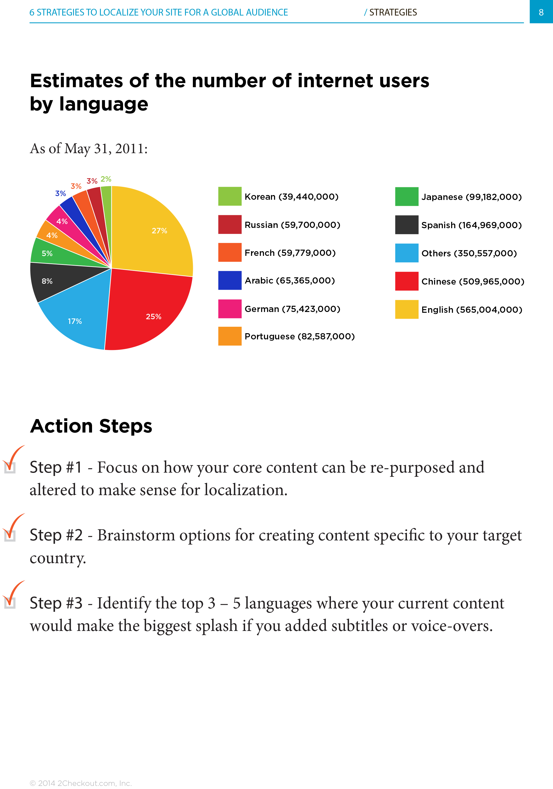
6 Strategies to Localize Your Site for a Global Audience

The Guide to E-Commerce Fraud

The Guide to E-Commerce Fraud

The Guide to E-Commerce Fraud

Pricing for a Global Market

Pricing for a Global Market

Pricing for a Global Market

How to Pick an Online Payment Processor

How to Pick an Online Payment Processor
BRANDING AND STYLE GUIDE

One of the first projects I prioritize in a communications manager/director position is establishing branding and language guides. Inconsistency—no matter how subtle—destroys authority. A style guide dictates whether a communications team uses Oxford commas, prefers JPG to JPEG (or is tolerant of both), or categorizes its company name as a plural or singular noun. The guide should also reinforce the basic tenants of good writing formalized by William Strunk Jr. and E.B. White: avoid passive sentences, cut unnecessarily adverbs, restructure dangling modifiers, and employ active verbs, among many other best practices.
Of equal importance, branding guidelines also define the visual elements that a company uses to represent itself. I formalize a list of fonts, colors, ratios, and sizes to ensure visual uniformity, no matter the medium—from web to letterhead and promotional items.


BLOG GRAPHICS

I often oversee an umbrella of responsibilities in my role as communications director or editor—writing, design, branding, social media, etc. Having worked at a design agency (C&G Partners) and professionally photographed for various clients, I always aim to put as much thought into aesthetic as words. For 2Checkout, this entailed writing visual branding guides alongside written style guides (two halves of the same whole that should never be without, seen above). With 2Checkout, I strived to convey a sense of cleanliness, professionalism, and energy that would invite a global audience to dive deeper into our content and instill a sense of thought leadership. Note: the above samples were designed by Simon Paul. Second note: though I primarily used the Gotham font, the hashtags titling didn’t follow a set style guide as the formal title of the blog was written above. Here are some examples of blog titles, video graphics, and infographics designed by me.


MISC. PROJECTS
The following samples offer a glimpse into other projects and communication form factors I worked on during my time at 2Checkout. Aside from one-off projects, some of these hint at series whose media no longer exist, but had a large scope. I produced a video series called The Payments Glossary, whose strategy was to secure superior SEO placement around specific terms in e-commerce. I’d produce a short video with a host (sometimes me) explaining the term, with a written analysis on the same webpage, and an infographic if appropriate. I also wrote press releases, hosted podcasts, and edited/co-wrote white papers alongside industry thought leaders from Mastercard and major banks.

A mock-up for a web relaunch

A graphic for a new inline design feature

A web header for our first 2Checkout podcast, featuring e-commerce experts advising on various topics. For this episode, Swiss design guru Steff Geissbuhler gave tips on how to design for conversion.

A white paper graphic explaining credit card processing

Graphics advertising our payments glossary, a video series that explains the language and ecosystem of online payments